why is a map different from a diagram? i recently heard the MTA’s typical subway map described as a bit of a misnomer, because its lack of strict adherence to physical layout instead makes it a diagram.
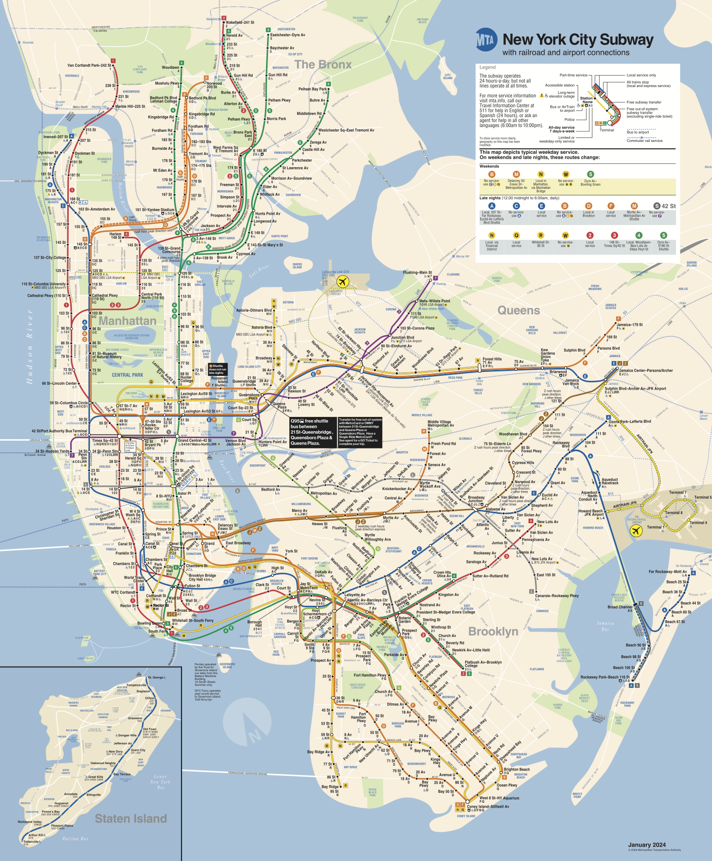
what if we stubbornly held that this is, in fact, a map? there are lots of different types of maps of the same underlying earth—not just displaying different information (streets, topography, buildings), but different projections as well. the subway map does display our earthly terrain, but under a rather unorthodox projection.
how might we better understand this projection? by viewing satellite imagery of the city under it. i built this project to do that—hit the “transform!” button to see the mercator projection morph into the MTA projection.
TODO
- fix across some more browsers (scaling seems like it has some issues in chrome among others?)
- beautify a bit
- maybe add a bit of dynamism even when not actively transforming